Image quantizing is the process of reducing the color count in an image in order to make it compress better (in png or gif formats). It is so a lossy method of compression, however a consistent one at that. Why someone should do this, and how it can be done the right way? This article tries to cover these subjects.
Why quantize? What is it?
So first, why quantize images: what is the benefit, where it is necessary? Some good points for quantizing are as follows:
You are publishing images on the web (including elements of a website design), so it is beneficial to get things as small as possible. It is not always the right thing to use the JPG format, and sometimes it is even impossible to use it (such as when the image has alpha component).
You are packaging a primarily 2D game with lots of sprites and other bitmap graphics, and you want the distributable as small as reasonably possible (for network downloads). For the need of transparency, you might again simply have to rule out using the JPG format.
You want to develop for some retro architecture such as an Amiga, where you can only access a limited set of colors, however you need to add some originally "truecolor" image resources.
Then, how this quantizing works? In very short summary, it increases the compressibility of an image by reducing the color count, so larger areas on the image end up being represented by the same binary value (which is good for compressibility). The color reduction is performed by intelligently figuring out ares of the image which are almost identically colored, and selecting an appropriate color to fit all. The PNG and GIF image formats can benefit from this greatly.
What tools do I need?
First and foremost, you might have some image manipulation program. It likely can quantize, and save in PNG format. But better forget it. If you want something fast, you may want to visit PNGQuant, and from there TinyPNG, which is the best quantizer available so far, and it is even accessible online on the latter site for trying out.
Otherwise, there are some other notable tools, which will be looked upon below. One of those covered is my own experimental quantizer relying on PNGCrush and ImageMagick.
The big quantizing how-to
The quality of quantization
Since quantizing is a lossy operation, it is important to know how to judge the quality of the images passed through the operation, to see when the size-quality trade-off is right. First these aspects will be demonstrated using three quantizers:
The quantizer in Gimp, version 2.8. It is a sloppy solution which "does the job".
My experimental quantizer (InsaniQuant), producing acceptable results, slowly.
The PNGQuant quantizer mentioned above, which in overall performs best, and does it fast.
Probably the most important parameter when quantizing is the desired color count. The more colors are permitted, the better will the image look, however it will also be larger.
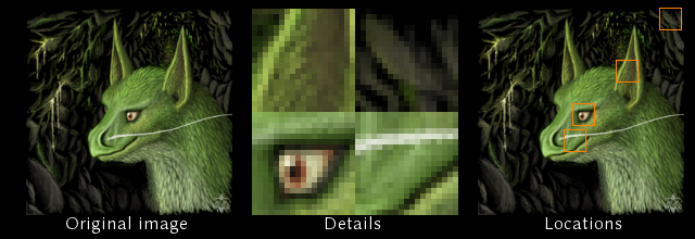
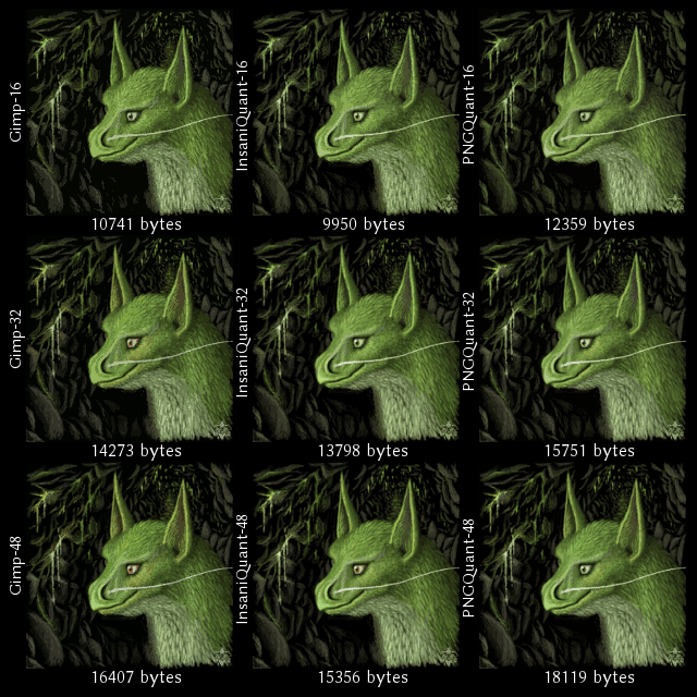
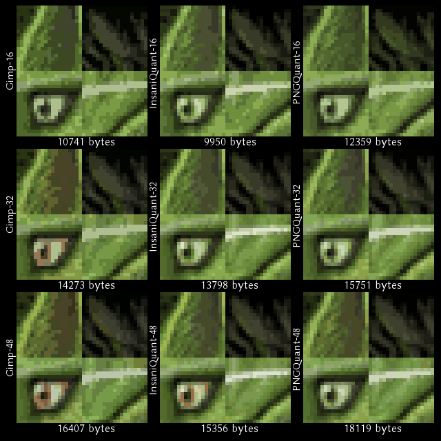
For the first glimpse, the nine images might look very similar. However, check the small details:
Targeting 16 colors neither of the quantizers reproduced the red of the eye.
PNGQuant on 16 colors made the cave glowing green. This is for that it apparently considers luminosity the most important, discarding hues to rather reproduce an useful gradient. Note that it does not even reproduce the red of the eye at 48 colors.
Gimp reproduces well hues, however it sacrifices gradient for it, so larger flat colored regions appear. Also note that for the interior of the ear it used two almost identical colors on all color count targets, wasting a palette entry.
So basically these are things to look out for when observing the palette generation. Note that dithering was disabled: it makes easier to judge the quality of the palette, which is the most important characteristic of the quantizer (so you should always run such a program without dithering first to see how it performs in selecting colors).
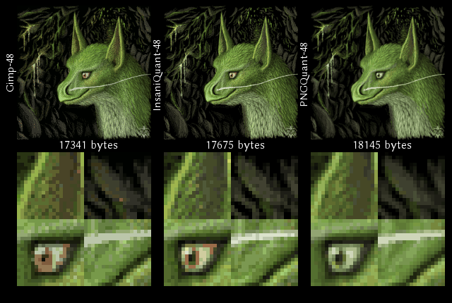
For PNGQuant's credit it must be mentioned that it reproduces gradients exceptionally well which will be shown further below. It performs better in quality for larger color counts (which is the more important for most use-cases).
Now let's turn on dithering:
Gimp here may look acceptable, however it's Floyd Steinberg ditherizer tends to spew out a lot of noise certain cases, even at larger color counts. Even here, some stray pixels which look out of place are observable.
PNGQuant barely did anything for dithering, which is the right thing for the palette it chose for this image: there are no colors in it to reproduce missing details, while the rest is covered well. In overall it's ditherizer feels quite pleasant.
InsaniQuant a bit overshot with dithering, increasing the contrast of the image beyond the original's, however it still produced a pleasant result.
In general the problem with ditherizers is that sometimes in some applications they litter around a lot of "noise": individual pixels which are colored notably different to their environment. This artifact is usually noticeable, however it should be remembered to be checked for example when bulk-converting.
Ditherizers, if they behave properly, can increase the quality of the image at the same color count, however they also make the image less compressible. They should only be turned on when the image is already covered well with the palette, or a color count constraint (typically 256 colors) is reached without achieving the desired quality, such as banding is still present.
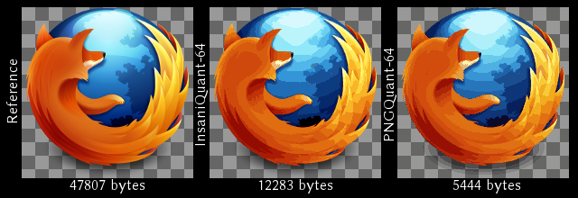
Now if banding was mentioned, let's cover a more appropriate test image (a Firefox browser icon) demonstrating it well (dithering turned off):
Gimp is not capable to quantize this logo properly since it doesn't understand the concept of alpha on palettized images.
While InsaniQuant's and PNGQuant's result look similar, note the big size difference and the banding on the shadow of PNGQuant's output. These are explained below.
Banding is the most observable on the globe. If dithering was enabled, it wouldn't be visible, however the generated palettes would still miss these colors: dithering would have to mimic those. This increases the size of the images. A better solution observing such a result is increasing the target color count until most of the banding becomes tolerable, and only turning on dithering then (while observing the resulting sizes to see which works out best).
Now, onto the differences between InsaniQuant and PNGQuant. The base of the strange size difference is that PNGQuant is capable to produce ARGB palettes into the appropriate PNG format while the scripts governing InsaniQuant only produce an RGB palette with a separate full alpha layer, which compresses worse. PNGQuant is better at gradients: while the observable banding is about the same, PNGQuant also used colors to generate the shadow in it's output ARGB palette.
What should be quantized
After the long details on quality matters, let's see what should be quantized, and probably what not. First, the most important lossy alternative: JPG.
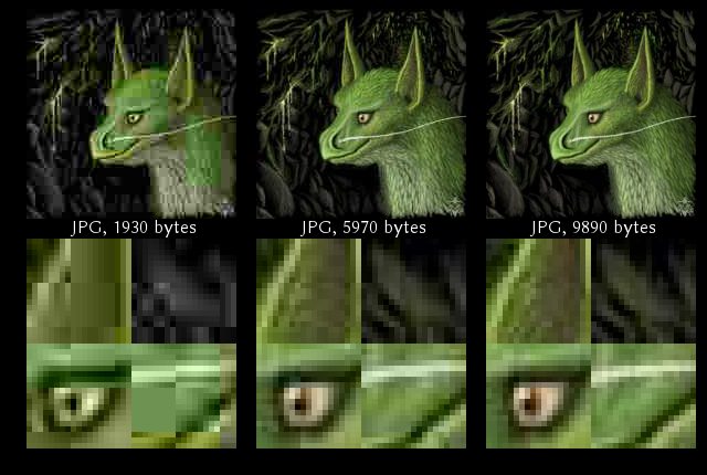
The leftmost image, of course, is completely unpractical, it just demonstrates the nature of JPG artifacts: the behavior of large chroma blocks and in general, blocking. The middle image is one where at first glimpse the artifacts may not be that apparent, however comparing with the leftmost, they can be identified. The rightmost image is about what could be used for web presentation in case where high quality is not important: it differs from the original, however it is pleasant to look at, and represents the subject properly.
Compare the sizes: even the rightmost image is smaller than either of the quantized variants while producing a better looking result than either. This is one case where quantizing is not the right approach.
So in general, what should be quantized?
Flowcharts, graphs, diagrams of any genre, pie charts and anything alike: these all use a few colors in large uniform areas which work well for quantizing. Typically just going for 256 colors is an okay choice for these since there are not many areas which actually need color reduction. Dithering should be turned off. These types of images will be larger and look hideous in JPG. If possible, you should however look out for using these in vector format (SVG).
Traditional logos with a few colors, same principles apply like above. Again, if possible, use vector format (SVG) instead.
Pixel art, artwork for most 2D games. Part of these are designed especially with a limited set of colors, and some may even have repetitive details which work well for PNG naturally.
Anything having or demanding an alpha channel or even colorkeyed transparency. These types of images can not be saved in JPG, so your only choice is using PNG. PNGQuant does a wonderful job for these.
Line arts, digital material for comics, sketches. These might look better for the same size quantized than saved in JPG format, also depending on the style of the particular piece.
What definitely should not be quantized?
Photographic, digital art pieces should be published in JPG format where size is a concern: for these, a smaller size can be achieved for the same perceivable quality than with quantizing.
Screenshots from modern video games also compress better for the same quality in JPG.
What to use for quantizing?
Like mentioned and demonstrated above, the best all around solution is using PNGQuant: it will definitely give you the best results for the most typical scenarios.
Fun with quantizing
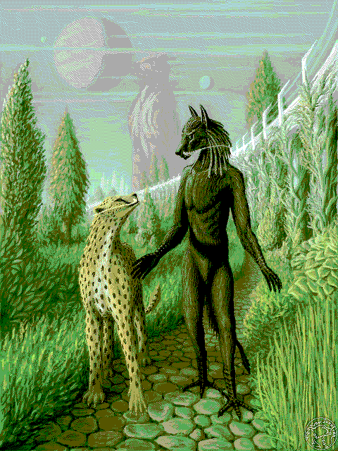
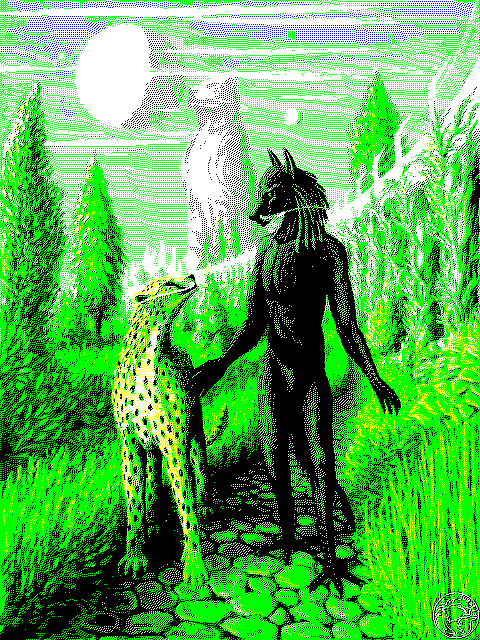
Quantizers may also be used to produce some interesting effects, notably by reducing the color count of images to some particular strange target. Producing similar images to the examples below are only possible with my InsaniQuant quantizer (only that offers a target palette depth setting suitable for these).
So let's get some pictures for an EGA: Enhanced Graphics Adapter, that old thing from the past with "digital" output, capable to produce 16 colors out of a pre-defined palette of 64.
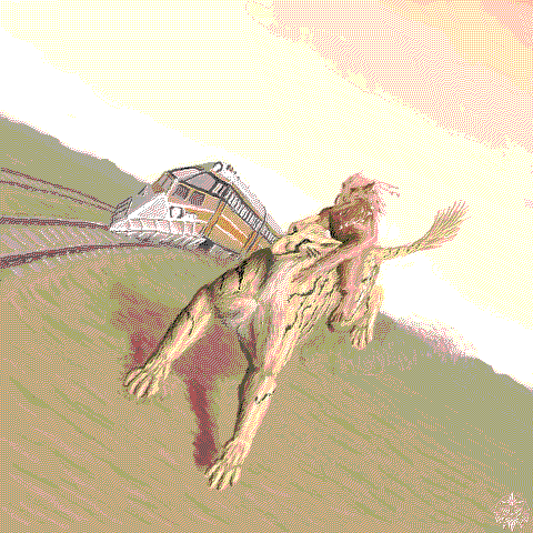
Let's get even below, what about some Spectrum style? Only eight colors to choose from:
Of course these images are larger than what was possible to display on the old EGA (which had at most 350 pixels vertical), but I found these interesting. The feature of depth-limiting the palette is also useful for other targets, however for example for an Amiga PNGQuant can also generate a palette (with it's posterize setting which can go down to produce a 4 bit target).
Make a comment
Rules
- Please be polite (Leave all your trolls in their respective caves).
- If #1 fails, don't feed 'em. They bite.
- No links allowed. It won't pass. Neither chains. Use '(dot)' notation.
- Spam reeks.
- Text is (some day will be) formatted with Markdown.
- Your mail address is only visible to me: I understand you also don't like #4.
- The mail address you provide is also used to fetch your Gravatar.
- Danger! High voltage! Right between your "Post Comment" button and ground.
- Still want to comment? Go ahead! :)
Comments
No comments so far. Be the first to comment!